Designing a platform for safe medication and supplement interactions
Overview
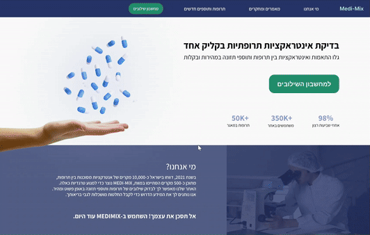
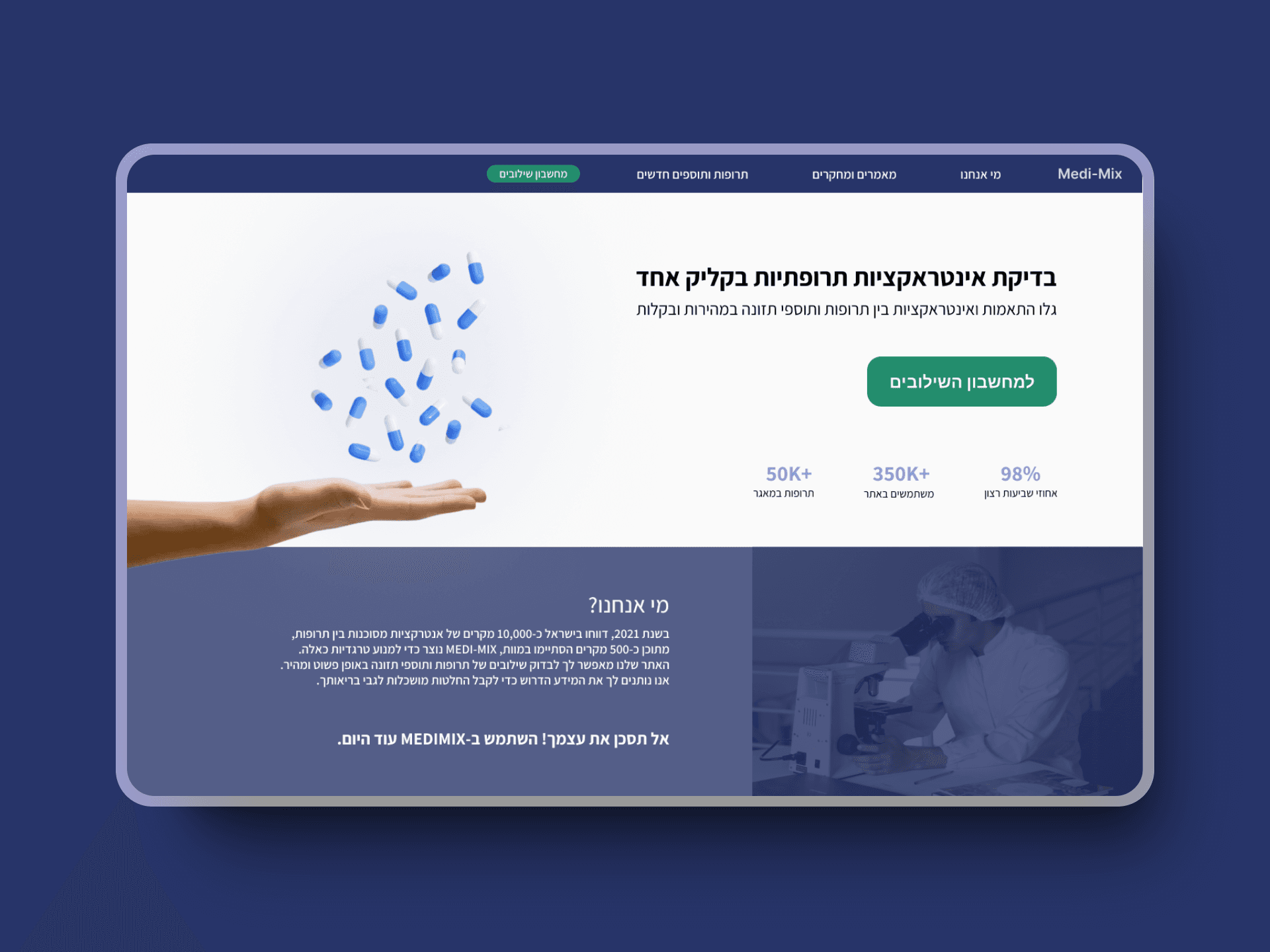
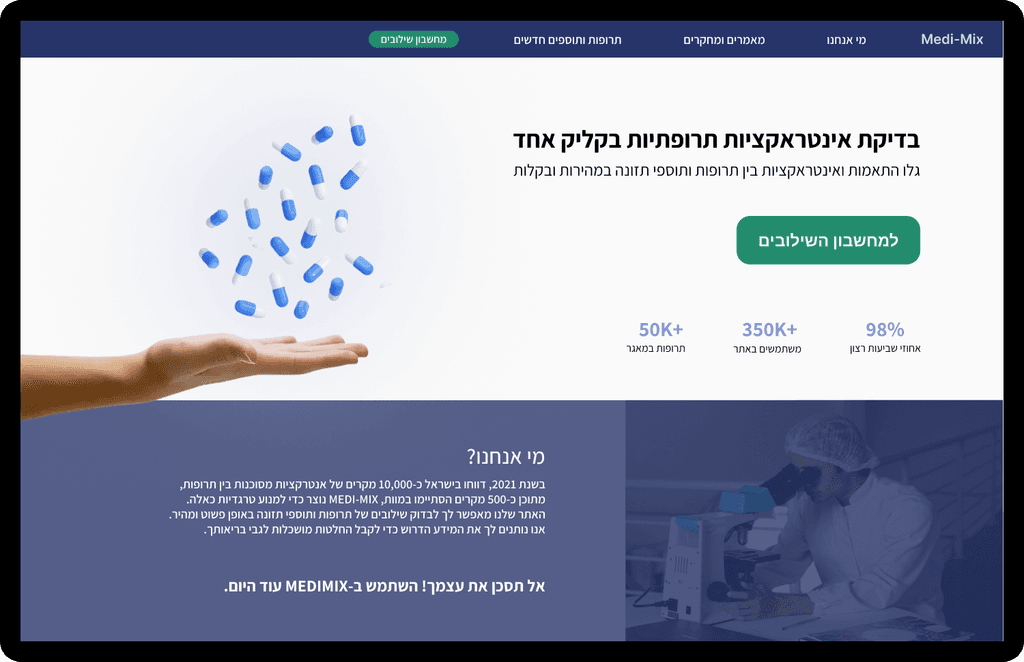
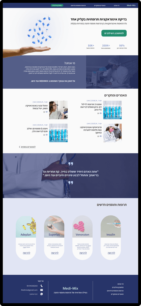
Medi-Mix is a web-based platform designed to help users quickly check for potential interactions between medications and nutritional supplements. This case study outlines our UX/UI design process for creating an intuitive and user-friendly interface for this critical health tool.
Our goal was to provide a quick and reliable way for users to ensure the safe combination of their medications and supplements, reducing the risk of adverse interactions and promoting better health outcomes.
Understanding the Problem

Each year, over 2 million cases of drug interactions result in disability, hospitalization, or death. Most of these cases are preventable
of the adult population (18+) in Israel reported consuming nutritional supplements

Two-thirds do not report this to their doctor

1 in 4 people take nutritional supplements alongside medications
The Challenge
Given the concerning statistics around drug interactions, there was a clear need for an accessible tool like Medi-Mix to check for potential interactions between medications and nutritional supplements. The website is not intended to replace professional advice from doctors or pharmacists but aims to provide immediate information for users who cannot consult a professional..
User Research
Survey Details
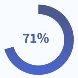
We conducted a comprehensive survey to understand user behaviors and needs, involving 45 participants, all of whom were over 18 years old. This approach allowed us to gather valuable insights that inform our design process.
Key UX Insights

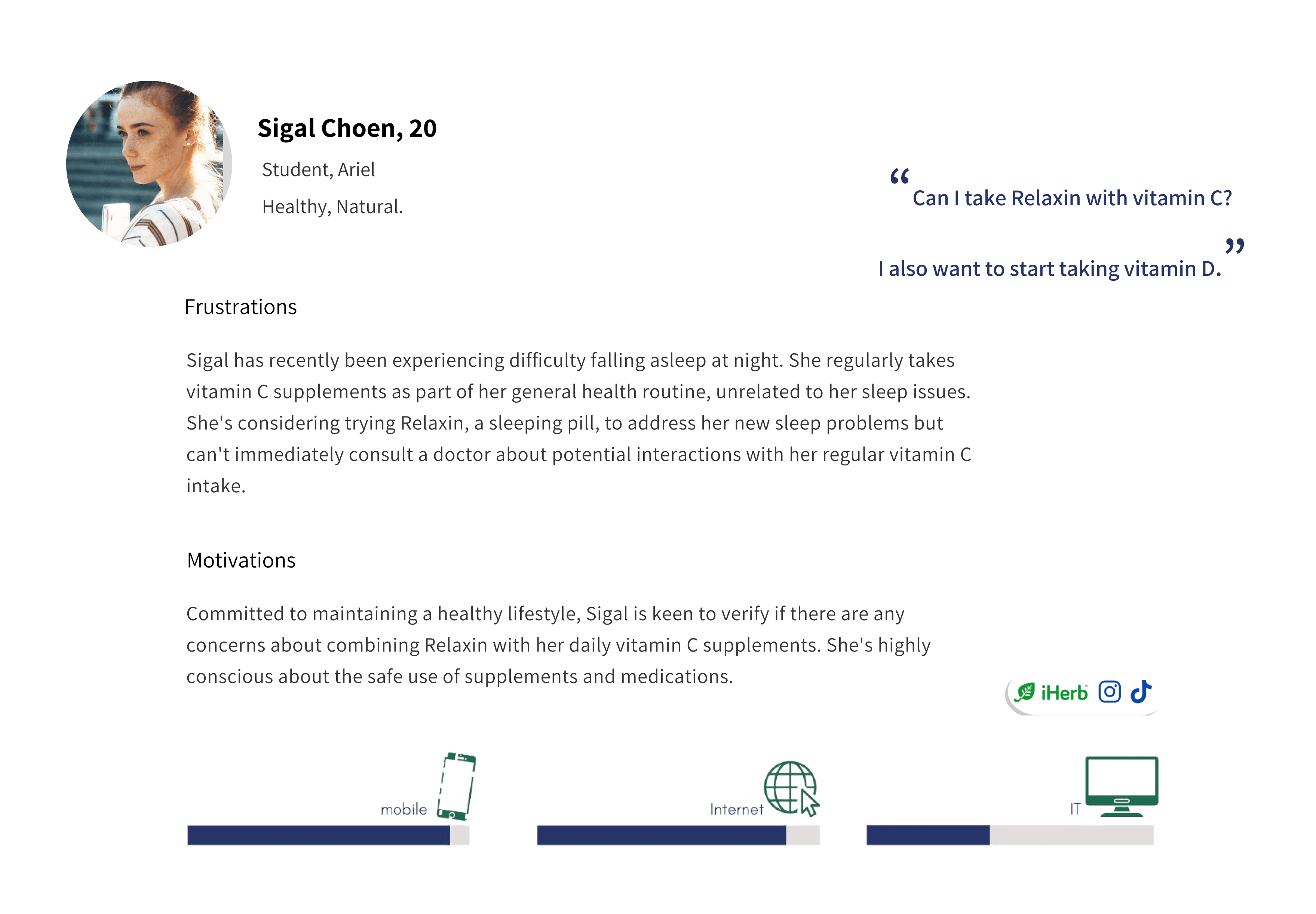
Personas
Design Process
User Flow
We designed a straightforward user flow to ensure a smooth experience:
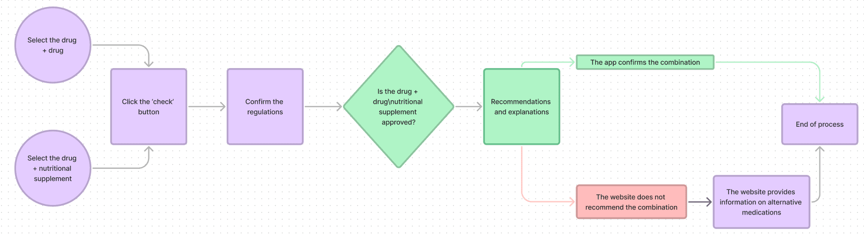
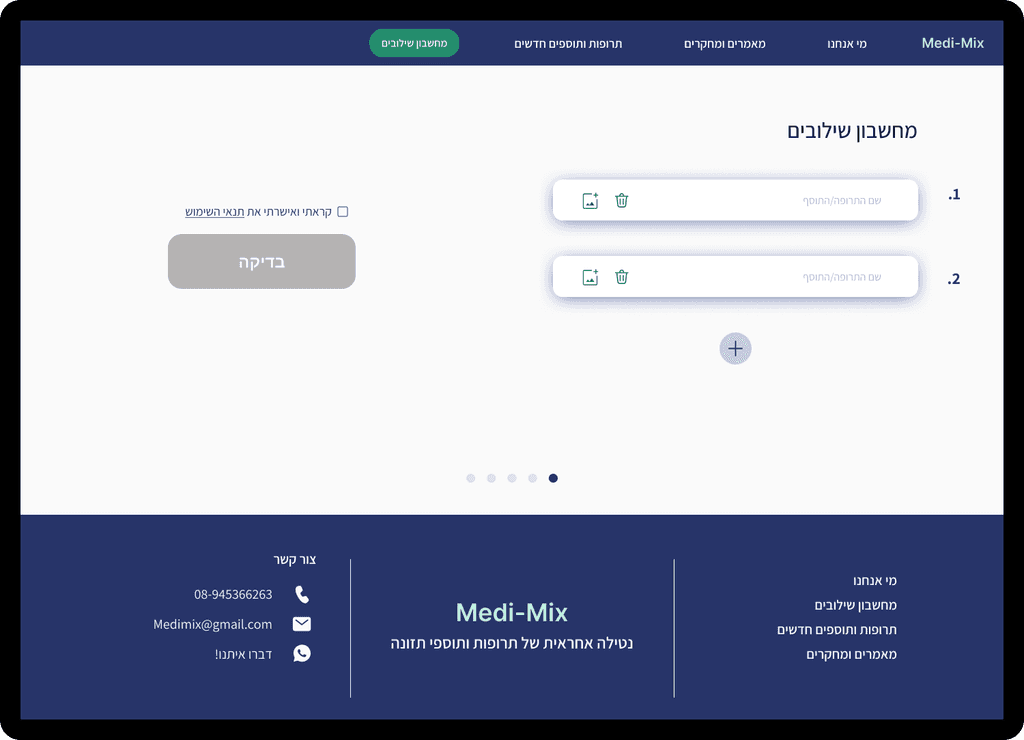
Select the drug + drug/nutritional supplement
Click the 'check' button
Confirm the regulations
The app checks if the combination is approved
If the combination is approved: The app provides recommendations and explanations > End of process.
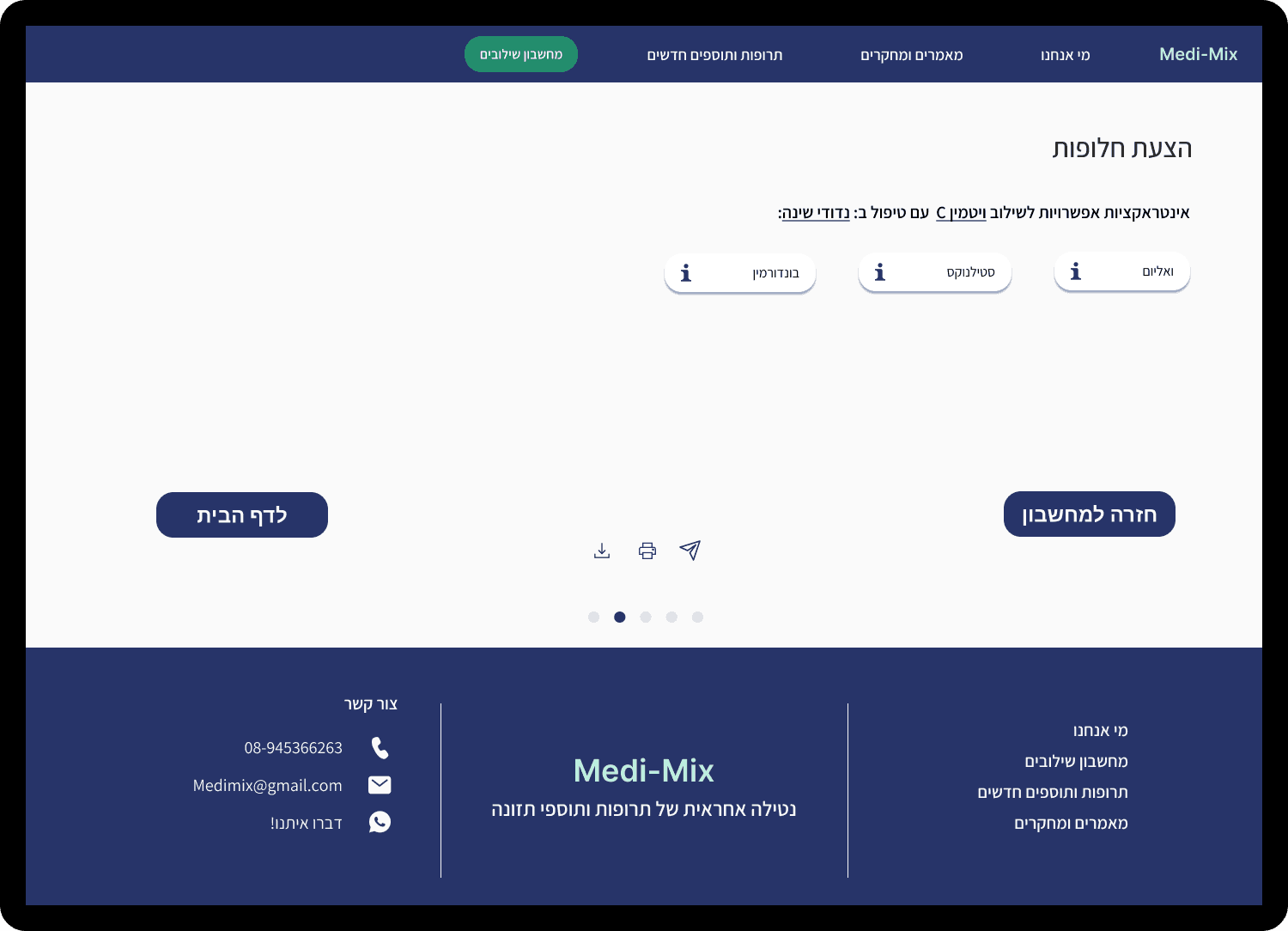
If the combination is not approved: The app provides information on alternative medications, offers a purchase option, and redirects to a relevant website > End of process.
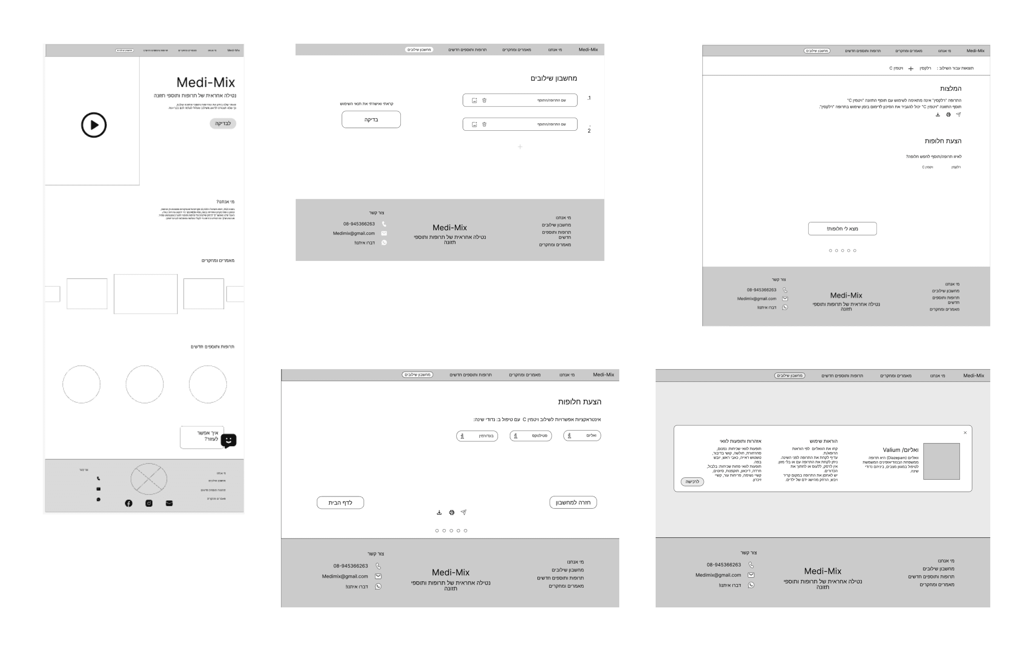
Wireframing
Initial wireframes focused on creating a streamlined user flow:
Visual Design
The visual design emphasized clarity and trust:
Clean, medical-inspired color scheme.
Clear typography for easy readability
Iconography to represent different types of interactions
Color Palette
Primary
#273469
Secondary
#1B6C53
Teritary
#90BCC6

Interaction Calculator Process
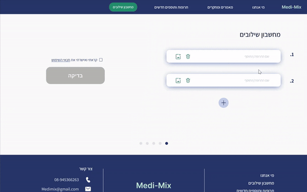
1. Input Medications
Simplicity and clarity: Clean interface with clear input fields.
Maximum flexibility:
- Option to input an unlimited number of medications.
- '+' button on the side allows easy addition of more fields.
- Smart button placement prevents scrolling to the bottom when adding multiple medications.Future-proof thinking: Design allows for scalability and complex use cases.
Visual guidance: Numbered fields guide the user.
Call to action: Prominent 'Check' button encourages process continuation.
Transparency and trust: Checkbox for terms of use ensures informed usage.
Accessibility: Simple design reduces barriers to starting the process.
Check Results - No Interaction
Immediate feedback: Use of green color and positive wording conveys safety message.
Reassurance: Calming design and colors reduce anxiety.
Memory and certainty: Displaying checked medication names reminds users of their choices.
Knowledge enhancement: Option to view additional information for curious users.
Flexibility: 'Back to calculator' button allows easy additional checks.
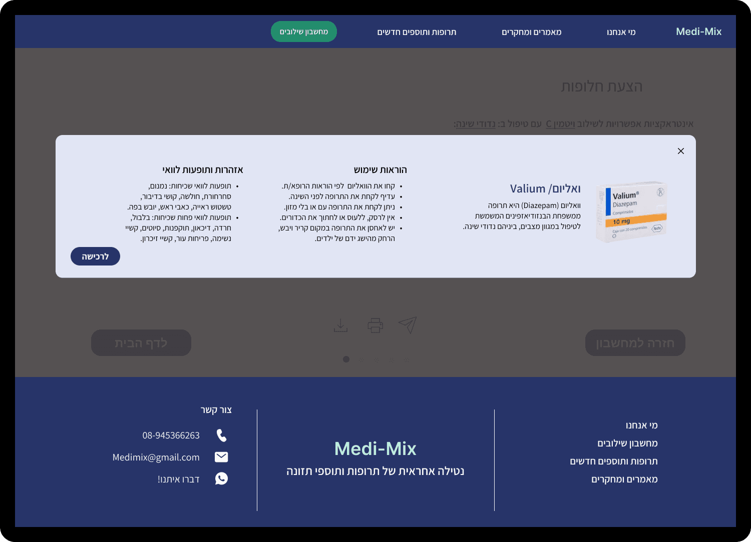
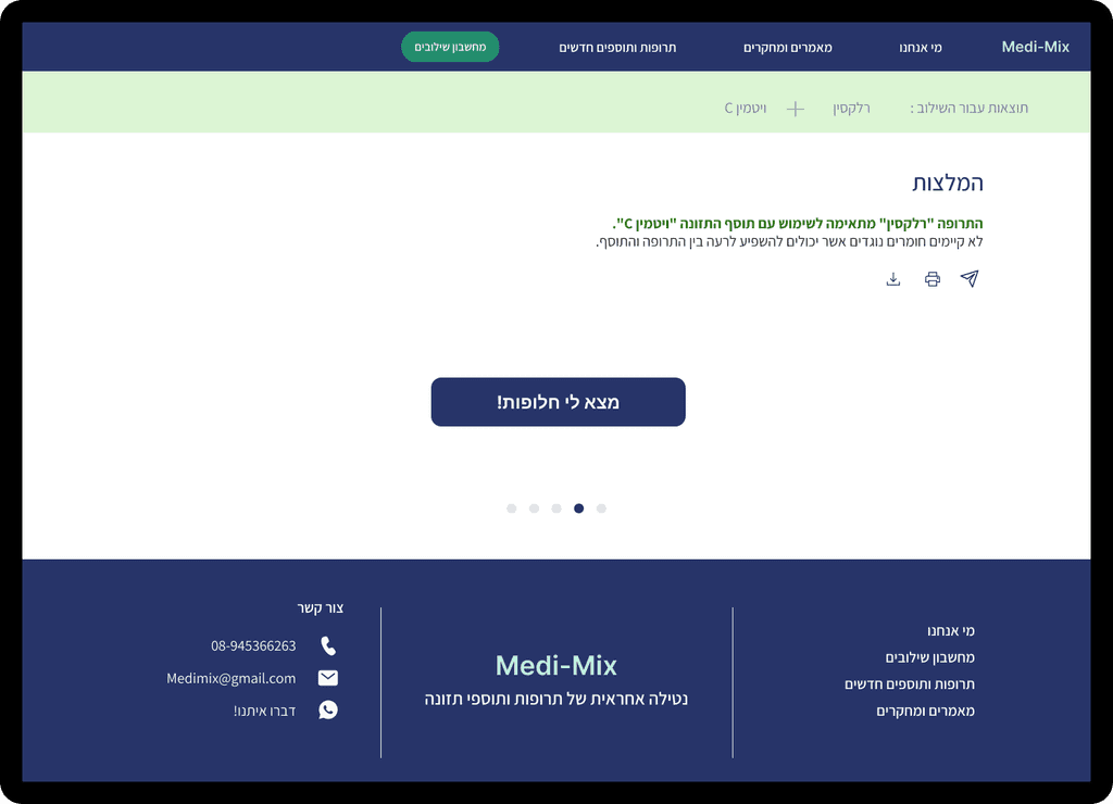
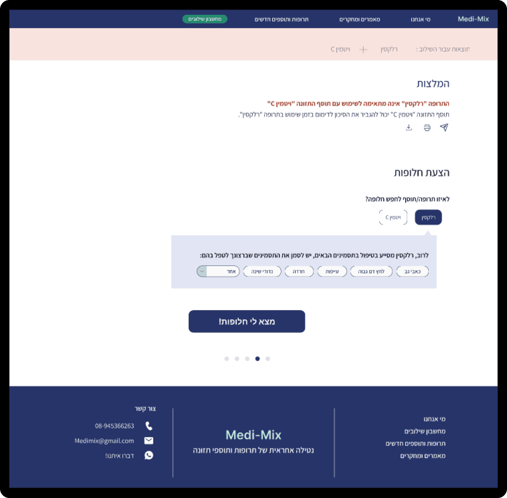
3. Check Results - With Interaction
Warning prominence: Use of pink-reddish color for immediate attention.
Clear information: Concise recommendations for quick understanding of the situation.
Immediate solutions: Direct suggestion of alternatives on the results page.
Guidance: 'Find alternatives' button leads to the next logical step.
Balance: Conveying critical information while avoiding unnecessary anxiety.
Control: Option to return to the calculator for checking additional combinations.
5. Detailed Medication Information